When this email was sent to us I knew straight away that I wanted to do the brief. Having already had meetings with potential clients about designing stationery for them, as well as completing the Tigerprint brief, this would be a perfect addition to my range of work to complete before Christmas break.
Ellen also mentioned that she wanted to do this brief as well, and as we live together, I asked her whether she would like to collaborate and we could work on the brief over the weekend. She said she would like to, so we started designing and thinking of ideas.
_Page_1.jpg)
_Page_2.jpg)
I asked Ellen whether she thought it would be a good idea to create a structure to follow so that we don't spend too long pondering over ideas. She agreed that it would be a good idea so I got a pen and paper and started to write out everything we needed to know.

Task 1 was to review all of the key words in the brief. This was just to make sure that we weren't missing out any important information. We spent 10 minutes doing this.

Task 2 was to look through our research we carried out in Marks and Spencer mainly and write down our initial reactions from the designs. We only spent 5 minutes doing this.

Task 3 was to write down all of our initial ideas for design. I had already been thinking about the brief before doing this exercise and had considered how we could use the Leeds College of Art mosaic logo and apply the shape to the shape of the cards somehow.

Task 4 involved reviewing all of our ideas and coming together to make a decision about our preferred ideas and which ones to develop further.

One of the ideas we came up with was to build different Christmas characters out of the mosaic tile shapes. I experimented with this idea and quickly applied the features to one of the shapes to see whether this would work. This would act as a 'do it yourself' card. We decided however, that it would probably be too many pieces for this card. It may have worked for a younger target audience though which is something to bare in mind.


Once we had decided not to take the previous idea any further, we then had a bit of a rethink. Although all of the ideas we had thought of would be possible, none of them jumped out to us as being the correct one to use. I suggested that we should maybe take the inspiration from the Marks and Spencer giant cracker we found, and create our very own, but adapt it so that it is a card and not a cracker as such.
Below is a photograph of the initial cracker which inspired me. I visualised in my mind straight away what our card would look like and started to design on my laptop as soon as I could.

Below are some screenshots of the cracker forme I have started to design. I am sure that this won't work the first time round but I am hoping that I can use the same forme for the final design and will only need to tweak it slightly. I am really excited about the end result and can't wait to start making some prototypes.


I then started to make some prototypes and apply some colour. Ellen and I discussed the colour scheme we should use for our cards and we both agreed that red and green would be appropriate colours to start using. Below are the images of the cracker formes with the colour applied to it. I also used the mosaic tiles to create a random pattern. I guessed how much I would need to increase the width of one side of the cracker by simply enlarging it slightly.


I then tried to experiment with the colour removed and the pattern simply outlined. I also applied a festive green to the cracker to see what this would look like. I won't know which one is the most suitable until I print all of them out and experiment with them.


Prototypes
Below are all of the digital designs above printed out and made. As I only printed these ideas out on my printer at home, the colour isn't exactly accurate. But I thought it would be worthwhile to print it out on white stock as well as some brown stock just to see which would be most effective for the final cracker.
Although I like the green cracker I don't think it is as effective as the red. It doesn't look quite as striking and memorable. I also feel as though the red is more obviously festive.

Here I was just testing to see whether the size was appropriate for the final cracker design.

I made these prototypes using brown recycled paper and only printed them out at small scale to make sure that they worked first before enlarging them to the correct proportions.


I also inverted the design to see what this would look like. I quite like it on the brown stock but still don't think it is suitable to be used for the final cracker design.

Out of interest, I printed a sample out on red stock to see whether any of the colours would show up. The green showed up the most but it wasn't very striking and definitely not suitable for the end design.

Final cracker to submit to marketing department
Below are the photographs taken of the final cracker which we handed into the marketing department. The holly took quite a white to cut out without leaving any white marks on show so if we are chosen for the competition we will have to print green on the reverse to make it a bit easier for ourselves.
I am really pleased as it didn't take long at all to perfect the forme for the cracker and we were able to locate string and bells in town quite easily, from Clintons cards and Marks and Spencer. The fact that we had carried out our primary research in Marks and Spencer allowed us to locate certain resources which was really helpful.


Ellen used the gift bag I bought in Marks and Spencer as inspiration for her characters. We wanted to make the card quite cute and playful whilst also giving out the message it needed to say. We did talk about illustrating the marketing team to put on the card but thought there may be too many to fit on such a small space. Instead, we decided that we could subtly illustrate ourselves on there, so we are the female elves!

The decorations on the tree are also made up from the same mosaic tile shapes. This is to maintain consistency across the card and also to have a strong focus on the LCA branding as we feel that this is becoming increasingly important since they updated it all. I suggested that we should write when the college was established in the sack.


We submitted our final design along with the costings list. I worked out the cost of all of the materials along with the time it would take us to make all of the cards and the finishing touches. A lot of the costings were estimates as we had not yet decided about which string to use for the final crackers for example. I was worried that the quote may be a little bit more than they were hoping to spend and really didn't expect to receive the email below with the subject 'Winners!' We were both over the moon when we read the email and started the production process almost straight away.


Production of the final cards
Below are all of the photographs of the final production line of all 75 Christmas cracker cards.

Firstly, we had to cut out all of the individual cracker pieces.

This left us with piles of 150 individual crackers to cut out by hand.

We then had to cut out all of the white tabs to create the shape of the cracker. We started off doing this by hand but then discovered that it was just as easy to cut them out using scissors.

Using a ruler we then folded all of the tabs back.

This is what the cracker looks like once it has all been folded back.


At this stage the crackers are ready to be folded in half. A little slit has to be made in the centre as well as a small triangular cut out. This is to make it easier to seal it.

Once folded, each cracker then had tape stuck to the tabs.


Once the tabs had been peeled away they were ready to be sealed.

This is what they started to look like.

I purposely didn't mark each cracker in the centre in case I calculated it wrong. But it turned out that there was no need to because it was obvious where the centre was when folded.

Once the crackers were made, the final touches could then be added. I cut the berries out by hand as well as the holly, then made a slit in each piece of holly for the string to feed through. The bell was then added as a final touch to create the third berry on each side.


This process then had to be repeated until all 75 cards were complete and ready to hand in. We sat in the studio for a good number of hours as well as at home to get them all done in time. We had said to each other than we would produce 15 per day leading up to the deadline but we ended up staying up one night and completing them the following day.


We decided that using the holly was going to be too complex for all of the crackers and we couldn't have used the laser cutter because it would have left a brown mark on them all as well as still being too fiddly to feed through a piece of string once all of the pieces had been cut out.

I then suggested that we could create some stickers instead. I mocked up a file quickly so that James could test our idea out on the vinyl cutter downstairs.


Once the stickers were applied we both agreed that the whole thing looked too flat and without the 3D added elements the whole design was ruined. This meant that the stickers were now out of the equation and we needed to think of an alternative.

I suggested that we should create tags instead. This would mean that we could use the guillotine to cut them all out and make life a lot easier for ourselves.
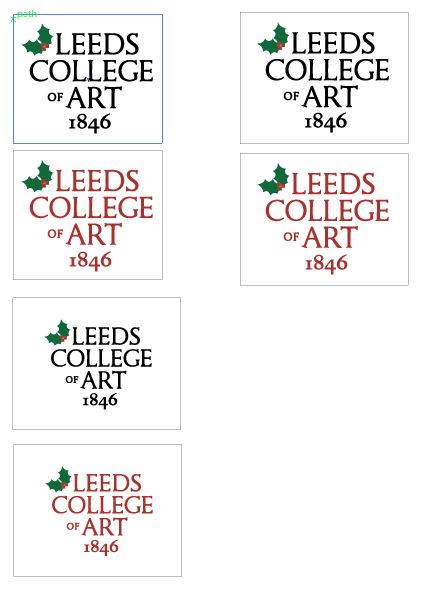
I printed a couple of options out to test them first. We asked a few people in the studio and decided that we liked the black text the most. I experimented with cutting the corners off to make it look more like a stereotypical tag, but this just seemed unnecessary work.

This is the final layout of the labels.

The production line continues:


Once we had applied all of the final details we placed them in a couple of boxes. We decided to use brown, green and red ribbon to give college a selection to choose from.


Below is the final invoice which I typed out to give to the marketing department. We ended up having to charge them more than we had initially expected, but they took us a lot longer to produce.

We took the cards to the principals office, as we had been to the marketing office and nobody was there because they were all at the graduation ceremony. We managed to catch the principal's secretary to show her the cards and leave them with her. We had already bought some envelopes for them to use to send them out in, but they seemed to think that they may need extra support (perhaps a slip of card) to protect the bell.
When we spoke to the principal she said she was really pleased with the outcome and said that they were the best they had ever seen in response to this brief over the years.
We also spoke to Amber and she seemed equally as pleased with them and said that they were outstanding. So overall, we were really pleased with the final products for this brief.
We also received this email to say thank you to us both which was lovely!

Final Photographs
Below are all of the final photographs of the crackers we submitted to the marketing department and the principal. We didn't have much time to photograph the end result so we will be photographing them again in time for the final submission to use in our portfolios. I am really pleased with the outcome of the cards and I am really pleased that we won this competition as it is something we can look back on and remember about third year.


