Thursday 30 April 2015

OUGD603 - Extended Practice: Briony Machin (Research)

When I went to House of Fraser today I decided to do some primary research. I wanted to have a look and see how their ceramics had been packaged, as this is something I am going to be doing for Briony. I got some really good ideas from quite a few different box designs.

I quite like the idea of designing a sleeve, but at the same time I can't really imagine this being very practical, and I can imagine Briony's bowls in a box with a pattern printed directly on it. 


I also like the simplicity of this design. The use of a photograph works really well to try and sell the product. However, with Briony about to graduate, I feel as though it is important to design a box which has quite a generic design and can be used for this range of pottery, as well as others in the future.


The feature I noticed about this box was the little tab that slots into the box to keep it closed securely. I am going to adopt this feature and include it in the design of Briony's.


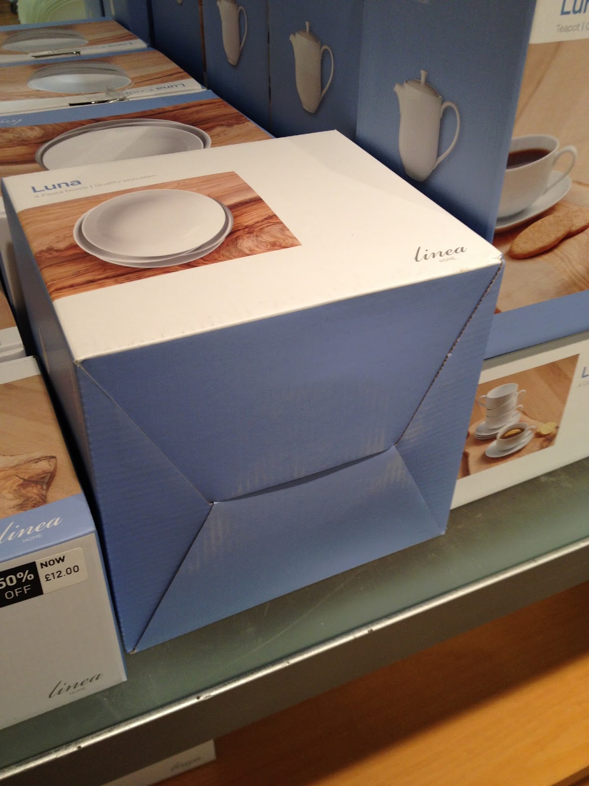
This lock closure on the bottom is also another secure feature to include. 


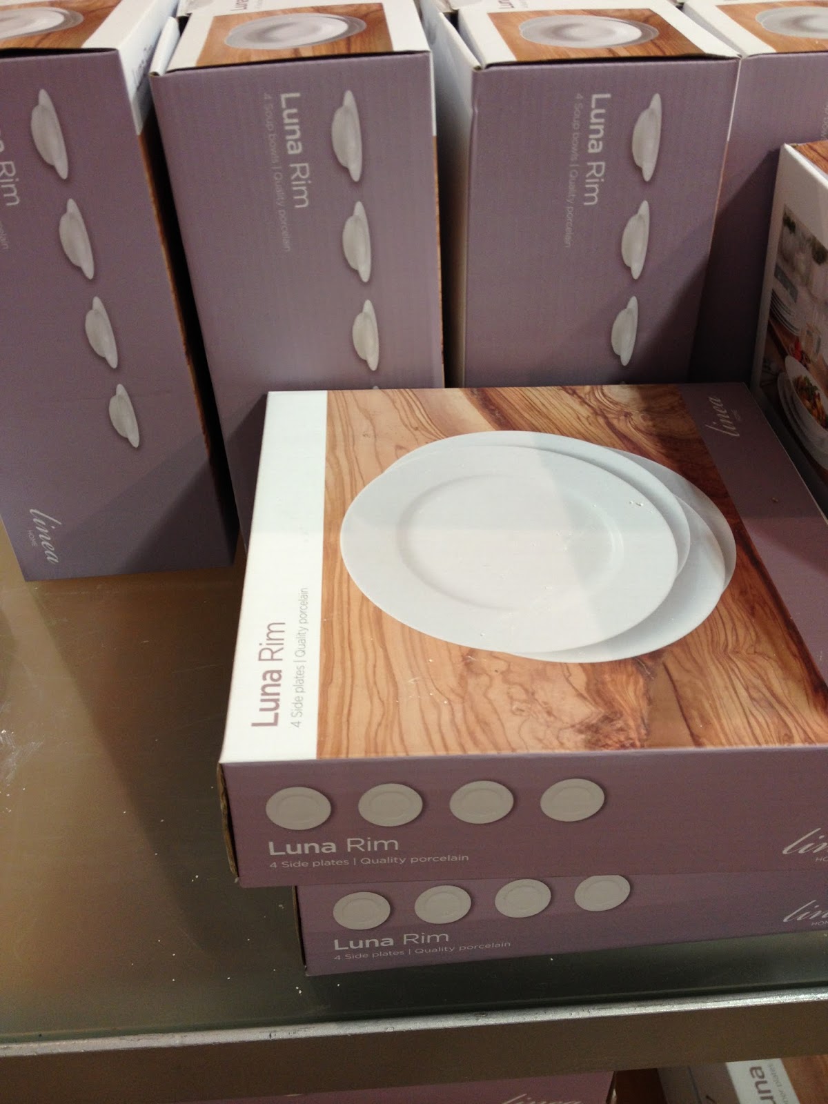
I love how the info graphics on this example have been created by using the photographs of the products inside. 


This simple line drawing is even simpler and cleaner. I think if I was to include information on one of Briony's boxes then I would use this method instead of photography. 


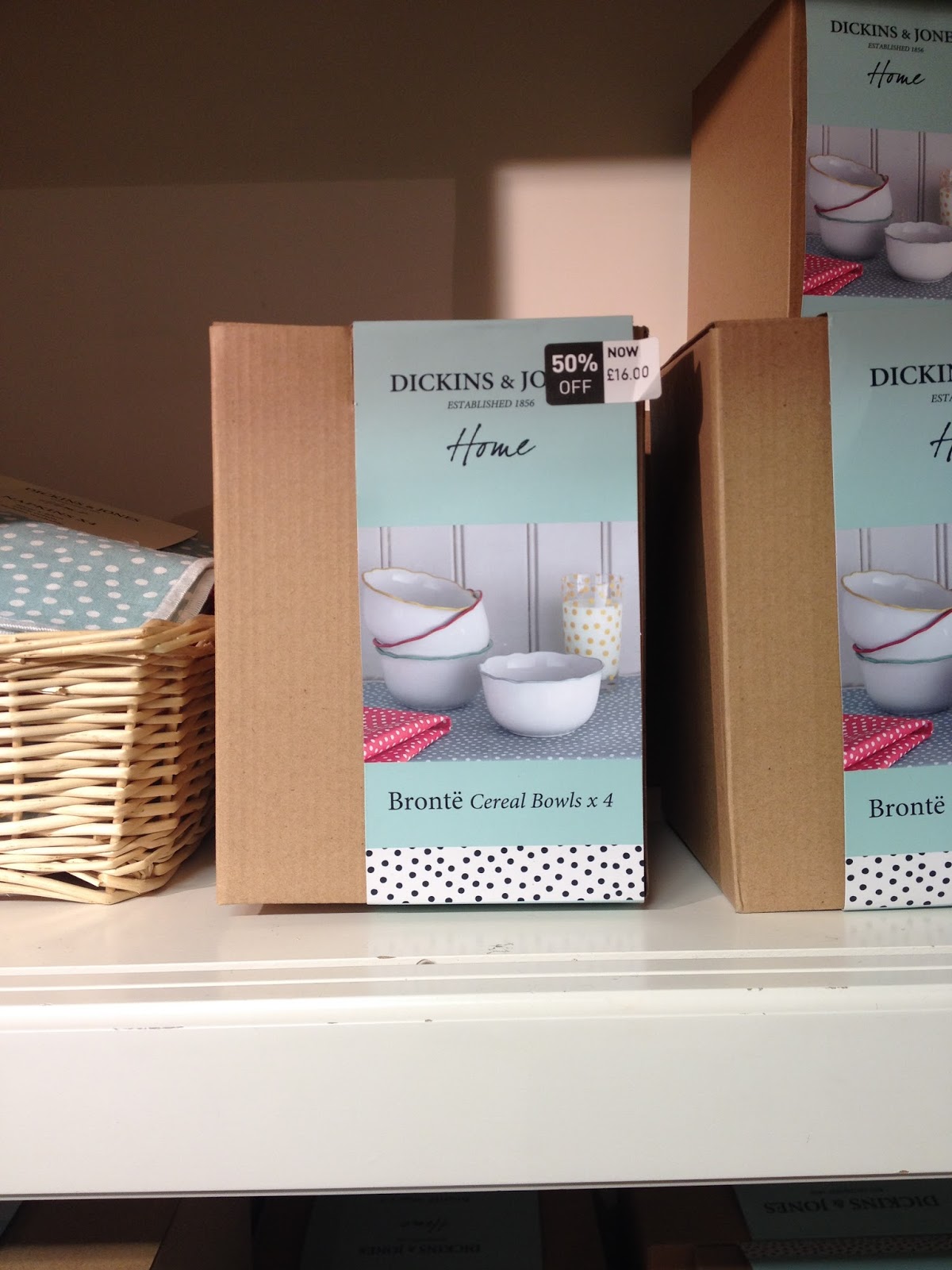
I took a photograph of this range simply because it reminded me of the design of Briony's bowls.


Friday 24 April 2015

OUGD603 - Extended Practice: Crackers (Gift Research)

I have been trying to choose something different to put inside of the crackers. I considered buying a range of different products randomly and placing them inside, but it didn't seem meaningful enough. I then thought about how I could look for some crackers to buy online and then scale the crackers so that the gift fits inside. Below, the first photograph is the set of nutcrackers I bought and photographed with the crackers.


Initially I bought these ones pictured below, but then they emailed to say then were out of stock so I had to start searching again. 


Thursday 16 April 2015

OUGD603 - Extended Practice: DBA (Development)

This post it to show how we approached the brief from start to end. I have found this a particularly challenging brief, and don't feel as though mine and Ellen's views were always heard and accounted for. My responsibility was to develop way finding and then in one of the meetings we had, it was decided that this wasn't necessary anymore. I therefore ended up taking on an art director's role for this brief and helped to make all of the decisions regarding the concept and the story of our idea. 


We carried out some research into negative space to find some inspiration, as we felt that we wanted to include a negative arrow within the design that would be pointing upwards to the North of the country.


Ellen had a go at letter spacing the logo and I thought it worked really well. But there were quite a lot of disagreements within the group and it was actually commented on by one team member who didn't believe letter spacing is necessary all of the time when creating logos. I felt as though this was a strange thing to say and comments like this made it hard to work as a group.


Colour was explored within this brief and Lizzy looked into the colour psychology for the logo. In the end we decided to use a maroon, but looking back we probably should have been a bit more adventurous, as this was some of the feedback we received from DBA. 


Trying to use the marque to make a pattern


We explored variations for the logo on a huge sheet of paper. This was quite good fun but also hard to get the logo just right.


When we took a variety of colour variations around the college to get feedback, this was the result. Everyone preferred the deeper colours so this is why we tweaked it slightly and went for maroon.


A responsibility of mine was to make sure that we had some high quality mock ups to show in our presentation. I spent a long time looking for appropriate images to use, and within the presentation feedback we received, the mock ups received a lot of compliments which I was happy about.